
subtlety.gif (6.8K)
|
Thanks for visiting this GIMP page. Sadly, it's massively out-of-date. It may still be interesting to you, so I haven't taken it down. Currently my more up-to-date GIMP projects are: Thanks for visiting! Zach |

Bad GIMP!
A lot of people will probably find this particular tip annoying and
pretentious, but don't worry, it's not the Gospel according to Xach. It's
just a collection of mistakes I've seen, and what I think can be done about
some of them. It's not a comprehensive, thoughtful guide (like this one), it's just a quick
rundown of the main complaints I have with some of the blunders people
make.
To show how unqualified I am to write this, let me tell you that I have no formal (or informal) design training or experience. I'm entirely self-taught/self-deluded. So when you see these points and say "Wow, he's so full of crap!" you're probably right. With that said, here's some things that annoy me.
GIF vs. JPEG
As any connoisseur of Internet pornography knows, jpegs are much better than
gifs. Or are they? Many people use jpegs in their web pages exclusively,
believing them to be the best thing since sliced bread.
Here's a few points in jpeg's favor:
subtlety.gif (6.8K)
That looks pretty good to me. And it compresses very well, too...6.8K isn't a whole lot. Compare the above to an unnaturally bad jpeg (below). Note the color bleed around the edges of the characters and the overall blurriness of the image:

subtlety.jpg (7.8K)
What the hell is wrong with that picture? It looks like complete crap. Before you start saying "Well, you must have saved it at 25% quality," it's at 75%. I made that image to show off some specific weak points in using jpegs. For starters, jpegs are a "lossy" format, meaning that they sacrifice some details to get good compression. However, all the "sacrifices" made in saving the image as a jpeg are very apparent in this high-contrast image.
Aren't jpegs supposed to be always smaller than gifs? What gives? Well, in the grand scheme of things, 1K won't make a huge difference. It should always be in mind that jpegs were not designed to handle large expanses of plain color very well, such as the large continuous areas of blue and red in the above image, and as a result the compressed file is slightly larger than the gif file of a similar image.
Subtlety
This one will probably get touchy. Don't worry! Relax! I'm not talking about
your web site here. This is just a general comment.
Some images are not meant to call attention to themselves. Even if they are, often there are certain elements that don't need to be emphasized or accessorized. Just because you can do a visual effect doesn't mean you should.
What do I mean by this? Well, take, for instance, the ubiquitous Plasma plug-in. It's great for all sorts of things. Texturizing text isn't one of them. I'm not so sure what looks good in these sorts of situations, but I sure as hell know what looks bad:

gimp.jpg (7.5K)
I've purposely exaggerated this example, and you know it looks bad, but some people seem to get so caught up in the tricks ("Oooh! Drop shadows! Plasmafied text!") that they forget that the overall impression is poor.
Of course, there are exceptions to this rule too. One of the premier GIMP sites uses a very visually stunning picture as the front-piece, and although it uses all sorts of hacks, they blend together in sort of a fascinating whole, with many small details and tricks to pay attention to. Of course, if everybody did that, it would get sickening very quickly.

gimp.gif (12K)
With my infinite good taste (hah!) I think that the above picture looks a hell of a lot better than the Plasmafied text. What do you think?
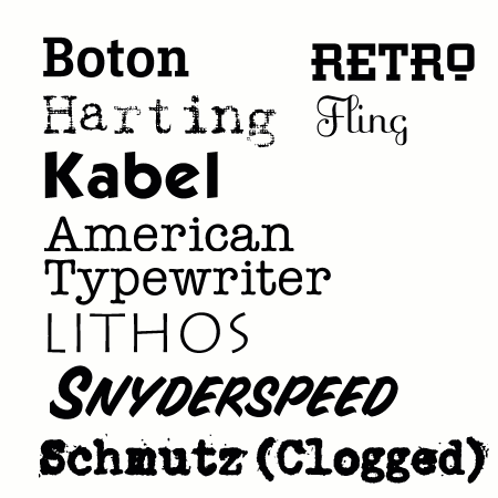
Fonts
Fonts! I must admit, fonts excite me. Whenever Esselte gives away a new font, I get
happy. Call me crazy, but if you use fonts all the time you might as well
spring for some nice ones to look at. Below are a few of my favorite fonts,
not necessarily in any order (and omitting many).
References
Here are a few links you may find helpful. I liked them!

