Untitled-1.0 (U1 for short)
|
This page is seriously out of date. While you may find it somewhat interesting, the information is a few years old and probably won't apply to what you're doing. If you're looking for current info, you probably want to see my GIMP News page, since it's the only one I update with any regularity.
|
Unfortunately, since I don't want to burden you down with dozens of images of huge sizes, some of the overall graphic impact of this tip may be lost. Try this out at a nice big size on some different images. You'll be impressed by the results.
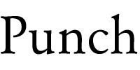
First, let's start with some basic text. The following is some nice Garamond text, 80 pixels, anti-aliased with a value of 3.
Untitled-1.0 (U1 for short)
We'll need a copy of this, so I'll Duplicate (Alt-D) it (Tip: learn the hotkeys, and learn them quick. Right clicking and dragging dozens of times gets to be a drag.) Offsetting (Alt-O) 4x 4y the duplicate and Gaussian blurring it (Alt-Shift-B) with a value of 2, then Inverting (Alt-I) produces this:
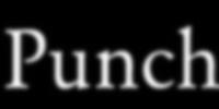
U3 (U2 was the Duplicate, which we can discard)
Sorry to skip so many steps, but did you really need to see all those intermediate images? So far, pretty boring. But, there's some good shadows hidden in the blur. Let's make them stand out by Adding (Alt-A) U1 and U3, to produce this very cool effect:
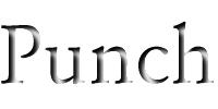
U4
Add works like a mask: the area the black pixels occupied in U1 were replaced by the pixels in U3. The white areas got discarded. We've effectively used U1 like a stencil to "paint through" with U3.
So now we've got a pretty neat effect; the text looks like it's a hole cut in a white piece of paper. Kind of neat...let's spiff it up a bit.
Let's make it look like the text is punched out of a textured image, like U5 below (look familiar?):
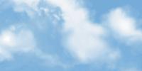
U5 (how slow do you want to go today?)
Now let's take a Composite of U4 and U5. We want it to look like the text is punched out of the sky. We want everything except the area where the text is to be replaced by sky. How can we do this? Well, with Composite. I just said that!
Composite is a very powerful channel operator. It takes one image as a mask, and two images to compose. If a pixel is black in the mask, it takes a pixel from the first image. If a pixel is white in the mask, it takes a pixel from the second image. If a pixel is gray in the mask, it takes even amounts from the first and second image. (Tip: Channel ops are usually best done with grayscale images. Introducing color into the mix makes for some fairly unpredictable results.)
Select the Compose tool. We want to use U1 as the mask (it's a perfect fit; every black pixel matches to our "punched" image and every white one will be filled in by sky). Since we want black to be filled by U4, select U4 as the first image. Since we want white to be filled by sky, select U5 as the second image. This gives:
Composite:
First Image: U4
Second Image: U5
Mask: U1
This produces exactly what we were looking for:

U6
Pretty neat, huh? You can even texture the text of the image...that involves using U4 as a mask with U1 as the first image, and the texture as the second image. I don't have any handy examples, but it's how I did the "Gallery" title picture. I should have used a different texture for the lettering, I suppose!
Happy GIMPing!
Zach