


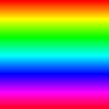
Hue, Saturation, and Value channels. Note that the Saturation is at the maximum values (giving the purest colors) and the Value is at the maximum values as well (giving the brightest colors).
HSV is a color model that defines colors based on their Hue, Saturation and value.
Hue, Saturation, and Value channels. Note that the Saturation is at the
maximum values (giving the purest colors) and the Value is at the maximum
values as well (giving the brightest colors).
The three channels Composed


Hue, Saturation, and Value channels. With the Saturation at half the maximum
values, look at what happens when the channels are Composed:

Colors appear more "washed out."


Hue, Saturation, and Value, this time with the Value set to half the maximum
value. Note that in the Composed image, it's much less bright:
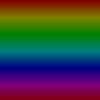 The brightness is half that of our first composed image.
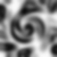
1) Our Hue channel
As you can see, our Hue channel is very exciting, varying from a lot of different shades of grey. This will produce a bright, colorful image. If you're wondering how I created this Hue image, see the Cows on LSD tip.

2) Our Saturation and Value image
Since we want both the Saturation and Value to be the maximum, we use a white image. We can use this same image for both channels; you can specify that in the Compose dialog box.
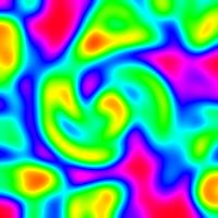
3) The final result
And we have something super-colorful. This is not necessarily powerful by itself, but it is a good tool to have when you need some wacky textures, with very cool colors.
Happy GIMPing!
Zach